Client:
Kristian Woodmansee
Date:
October 2021
Role:
Research & UX Design
Team:
Myself & 1 Developer
Overview
Logic BJJ is a mixed martial arts gym in Philadelphia specializing in Jiu-Jitsu (submission grappling). Logic launched its first subscription-based website that allows its 200+ members access to over 800+ technique instructionals and is updated with more videos every week.
Problems:
• The landing page has ambiguous messaging and no clear call to action button.
• Imagery doesn't give users clear context.
• Video filtering system is confusing for users.
• Failed to hit WCAG and ADA accessibility standards.
• Technical issues with loading videos and users experienced friction to find a related video.
• Users are frustrated they can't create their own playlists to personalize their learning experience.
Proposed Solutions:
• In our hero section give context of what we offer and assist this with an image.
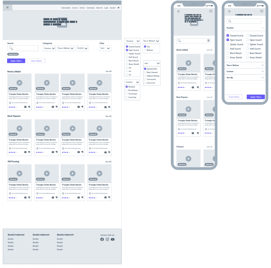
• Create unique filtering categories that can simplify a complex sport.
• New video player page that offers related techniques to keep users engaged.
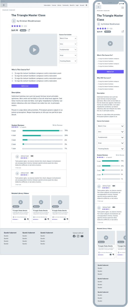
• Implement a new feature selling courses.
Deliverables:
• Competitive Analysis
• Survey
• One-on-one interviews
• Personas
• User flow
• Sitemap
• Mood board
• Wireframes
Results
• Increased average engagement time by 21%
• Retention rate increased by 40%
• Increased monthly revenue by 20% in the first 4 weeks
• One happy client
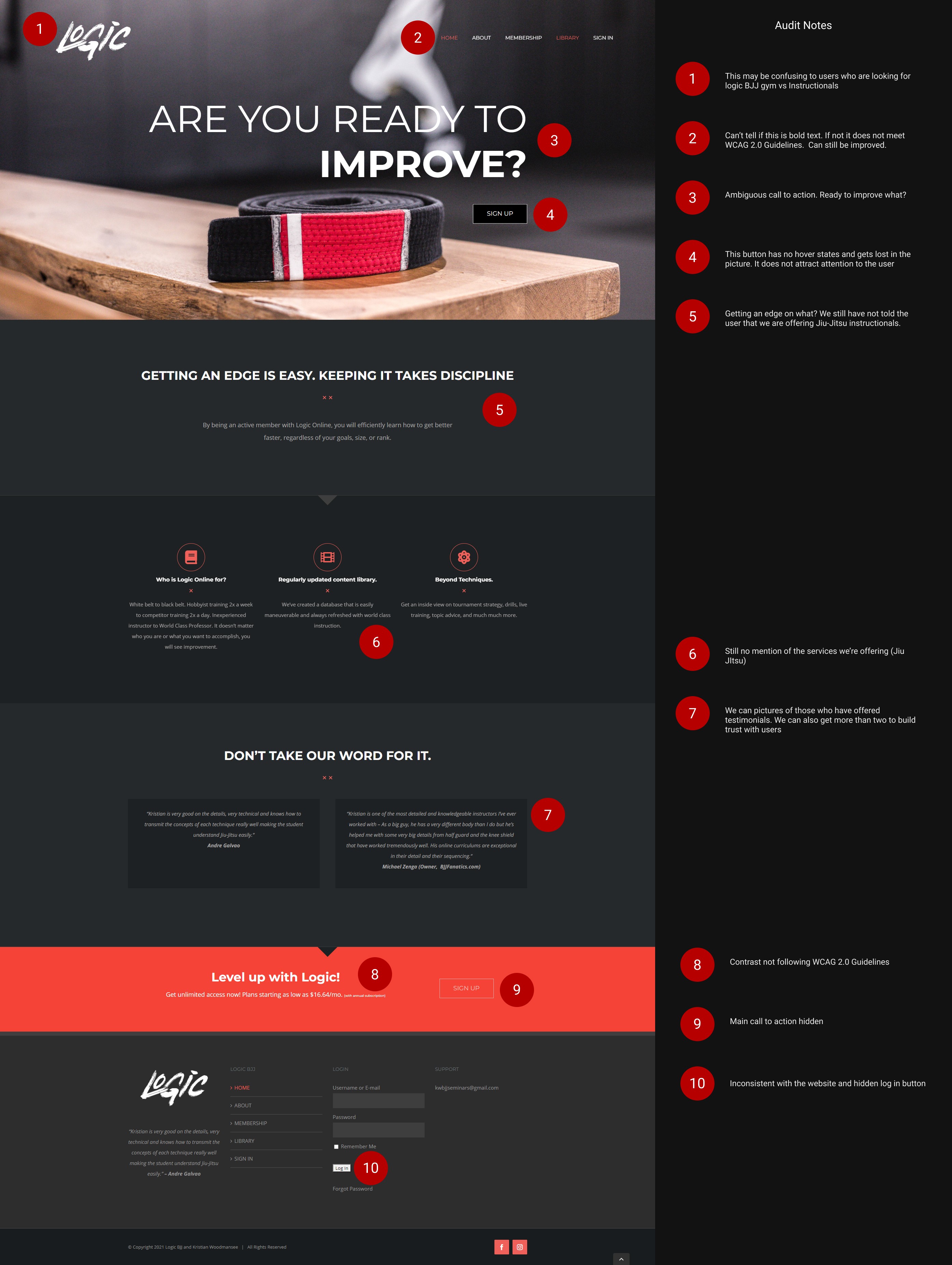
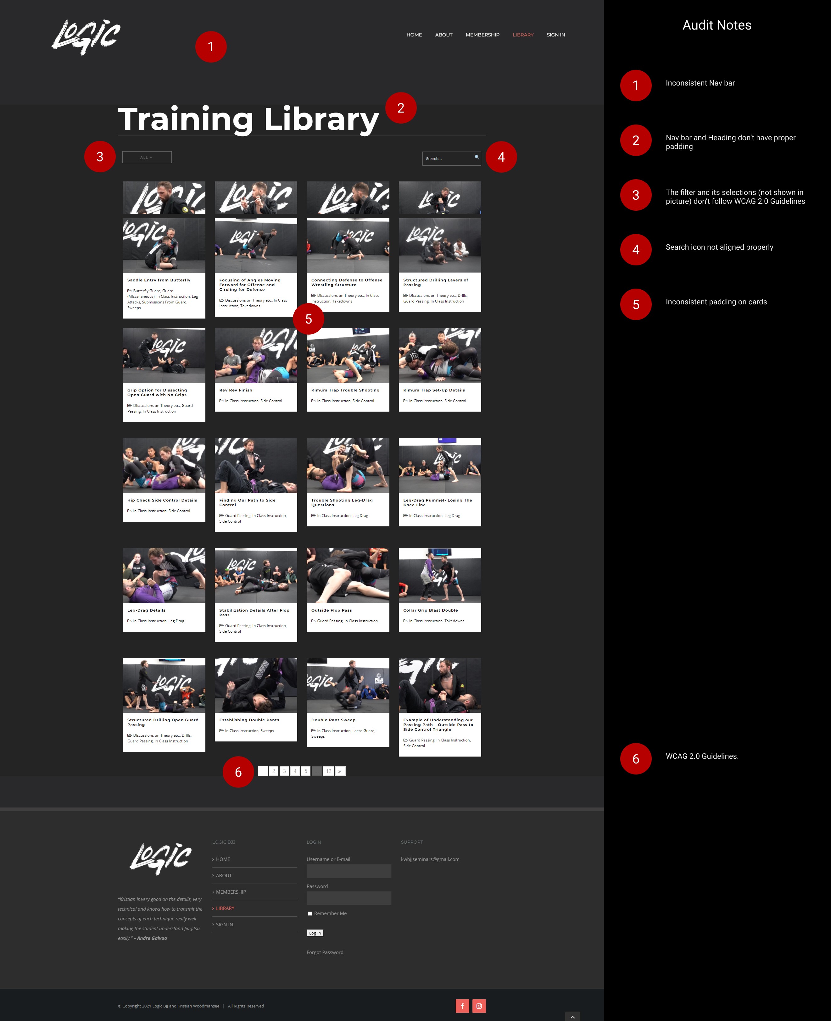
Website Audit
I did a general UI/UX audit of logics original website. It had many small errors ranging from accessibility, poor images, and messaging.
Findings:
• The landing page has ambiguous messaging and no clear call to action button.
• Imagery doesn't give users clear context.
• Messaging wasn't clear and had no mention of the value they offer.
• Failed to hit WCAG and ADA accessibility standards.
• Inconsistent buttons
Proposed Solutions:
• We proposed we re-designed the website from scratch due to there being so many issues with the current website and because it was very difficult to track down the people that built the original website.
Research
My research included a competitive analysis to understand what the current market is offering in terms of features, UX, and business structure. We received 24 responses to the survey we sent out to Logic's current subscribers to help us understand our members' expectations, frustrations, and needs. Lastly, I ran one-on-one interviews to gain insights into our user's journey.
Findings:
• Our members were frustrated with the filtering system that was giving them results they didn't expect.
• Members were frustrated they couldn't find videos they watched previously.
• Our members wanted the option to purchase courses.
• Members frustrated they couldn't find related techniques to the video they were watching.
• Members frustrated they don't have access to their billing information.
Proposed Solutions:
• In our hero section give context of what we offer and assist this with an image.
• Create a unique filtering categories that can simple a complex sport.
• New video player page that offers related techniques to keep users engaged.
• Implement a new feature selling courses.
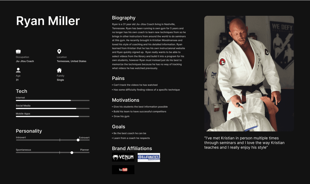
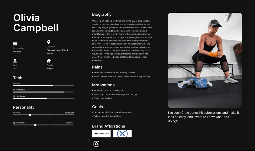
Understanding Our Members Motivations
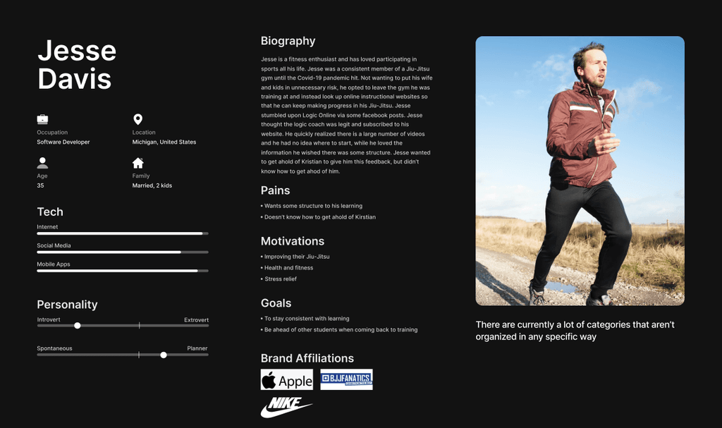
Following the interviews we had 3 main user personas that used Logic's instructional videos.
1. Coach
• Motivation: Elevate teaching methods and empower their own students with structured, comprehensive content.
• How They Use It: Craft personalized lesson plans, enhance coaching techniques, and foster a thriving learning environment.
2. Hobbyist
• Motivation: Embrace the joy of learning, enjoy flexibility, and deepen their passion for Brazilian Jiu-Jitsu.
• How They Use It: Dive into diverse tutorials, explore various techniques, and savor the journey of continuous improvement.
3. Competitor
• Motivation: Gain a competitive edge, refine skills, and stay ahead of the game.
• How They Use It: Engage in targeted, advanced training, dissect strategies, and leverage the platform for strategic advantage.
Understanding the Journey
By creating and exploring the main objectives of our website I focused in on the main 3 user flows.
1. User using the video library
2. User purchasing a course (new feature)
3. User saving videos into a custom playlist (new feature)

Navigating the Library Flow

Purchasing a Course Flow

Adding Video to the Playlist Flow

Visualizing a User-Centric Experience
Addressing user feedback, the proposed solutions for easy video navigation, quick pre-class technique review, personalized playlists, and a streamlined favorites list. The inclusion of skill-level tags—categorized as "beginner," "intermediate," and "advanced"—enhances accessibility, offering a tailored experience for every user.
Landing Page

Library Page and Filtering
Course Details
High-Fidelity Landing Page

Lessons Learned
1. Communication is key
This goes without saying, but sometimes hindsight is 20/20. During the early phases of the project, my developer and I weren't very clear on the constraints of developing the project, leaving a bulk of the designs and the playlist feature unused. Although the designs are used as a NorthStar for LogicBJJOnline to this day.
Projects

Client:
Kristian Woodmansee
Date:
October 2021
Role:
Research & UX Design
Team:
Myself & 1 Developer
Overview
Logic BJJ is a mixed martial arts gym in Philadelphia specializing in Jiu-Jitsu (submission grappling). Logic launched its first subscription-based website that allows its 200+ members access to over 800+ technique instructionals and is updated with more videos every week.
Problems:
• The landing page has ambiguous messaging and no clear call to action button.
• Imagery doesn't give users clear context.
• Video filtering system is confusing for users.
• Failed to hit WCAG and ADA accessibility standards.
• Technical issues with loading videos and users experienced friction to find a related video.
• Users are frustrated they can't create their own playlists to personalize their learning experience.
Proposed Solutions:
• In our hero section give context of what we offer and assist this with an image.
• Create unique filtering categories that can simplify a complex sport.
• New video player page that offers related techniques to keep users engaged.
• Implement a new feature selling courses.
Deliverables:
• Competitive Analysis
• Survey
• One-on-one interviews
• Personas
• User flow
• Sitemap
• Mood board
• Wireframes
Results
• Increased average engagement time by 21%
• Retention rate increased by 40%
• Increased monthly revenue by 20% in the first 4 weeks
• One happy client
Website Audit
I did a general UI/UX audit of logics original website. It had many small errors ranging from accessibility, poor images, and messaging.
Findings:
• The landing page has ambiguous messaging and no clear call to action button.
• Imagery doesn't give users clear context.
• Messaging wasn't clear and had no mention of the value they offer.
• Failed to hit WCAG and ADA accessibility standards.
• Inconsistent buttons
Proposed Solutions:
• We proposed we re-designed the website from scratch due to there being so many issues with the current website and because it was very difficult to track down the people that built the original website.
Research
My research included a competitive analysis to understand what the current market is offering in terms of features, UX, and business structure. We received 24 responses to the survey we sent out to Logic's current subscribers to help us understand our members' expectations, frustrations, and needs. Lastly, I ran one-on-one interviews to gain insights into our user's journey.
Findings:
• Our members were frustrated with the filtering system that was giving them results they didn't expect.
• Members were frustrated they couldn't find videos they watched previously.
• Our members wanted the option to purchase courses.
• Members frustrated they couldn't find related techniques to the video they were watching.
• Members frustrated they don't have access to their billing information.
Proposed Solutions:
• In our hero section give context of what we offer and assist this with an image.
• Create a unique filtering categories that can simple a complex sport.
• New video player page that offers related techniques to keep users engaged.
• Implement a new feature selling courses.
Understanding Our Members Motivations
Following the interviews we had 3 main user personas that used Logic's instructional videos.
1. Coach
• Motivation: Elevate teaching methods and empower their own students with structured, comprehensive content.
• How They Use It: Craft personalized lesson plans, enhance coaching techniques, and foster a thriving learning environment.
2. Hobbyist
• Motivation: Embrace the joy of learning, enjoy flexibility, and deepen their passion for Brazilian Jiu-Jitsu.
• How They Use It: Dive into diverse tutorials, explore various techniques, and savor the journey of continuous improvement.
3. Competitor
• Motivation: Gain a competitive edge, refine skills, and stay ahead of the game.
• How They Use It: Engage in targeted, advanced training, dissect strategies, and leverage the platform for strategic advantage.
Understanding the Journey
By creating and exploring the main objectives of our website I focused in on the main 3 user flows.
1. User using the video library
2. User purchasing a course (new feature)
3. User saving videos into a custom playlist (new feature)

Navigating the Library Flow

Purchasing a Course Flow

Adding Video to the Playlist Flow

Visualizing a User-Centric Experience
Addressing user feedback, the proposed solutions for easy video navigation, quick pre-class technique review, personalized playlists, and a streamlined favorites list. The inclusion of skill-level tags—categorized as "beginner," "intermediate," and "advanced"—enhances accessibility, offering a tailored experience for every user.
Landing Page

Library Page and Filtering

Course Details

High-Fidelity Landing Page

Lessons Learned
1. Communication is key
This goes without saying, but sometimes hindsight is 20/20. During the early phases of the project, my developer and I weren't very clear on the constraints of developing the project, leaving a bulk of the designs and the playlist feature unused. Although the designs are used as a NorthStar for LogicBJJOnline to this day.
Projects

Client:
Kristian Woodmansee
Date:
October 2021
Role:
Research & UX Design
Team:
Myself & 1 Developer
Overview
Logic BJJ is a mixed martial arts gym in Philadelphia specializing in Jiu-Jitsu (submission grappling). Logic launched its first subscription-based website that allows its 200+ members access to over 800+ technique instructionals and is updated with more videos every week.
Problems:
• The landing page has ambiguous messaging and no clear call to action button.
• Imagery doesn't give users clear context.
• Video filtering system is confusing for users.
• Failed to hit WCAG and ADA accessibility standards.
• Technical issues with loading videos and users experienced friction to find a related video.
• Users are frustrated they can't create their own playlists to personalize their learning experience.
Proposed Solutions:
• In our hero section give context of what we offer and assist this with an image.
• Create unique filtering categories that can simplify a complex sport.
• New video player page that offers related techniques to keep users engaged.
• Implement a new feature selling courses.
Deliverables:
• Competitive Analysis
• Survey
• One-on-one interviews
• Personas
• User flow
• Sitemap
• Mood board
• Wireframes
Results
• Increased average engagement time by 21%
• Retention rate increased by 40%
• Increased monthly revenue by 20% in the first 4 weeks
• One happy client
Website Audit
I did a general UI/UX audit of logics original website. It had many small errors ranging from accessibility, poor images, and messaging.
Findings:
• The landing page has ambiguous messaging and no clear call to action button.
• Imagery doesn't give users clear context.
• Messaging wasn't clear and had no mention of the value they offer.
• Failed to hit WCAG and ADA accessibility standards.
• Inconsistent buttons
Proposed Solutions:
• We proposed we re-designed the website from scratch due to there being so many issues with the current website and because it was very difficult to track down the people that built the original website.
Research
My research included a competitive analysis to understand what the current market is offering in terms of features, UX, and business structure. We received 24 responses to the survey we sent out to Logic's current subscribers to help us understand our members' expectations, frustrations, and needs. Lastly, I ran one-on-one interviews to gain insights into our user's journey.
Findings:
• Our members were frustrated with the filtering system that was giving them results they didn't expect.
• Members were frustrated they couldn't find videos they watched previously.
• Our members wanted the option to purchase courses.
• Members frustrated they couldn't find related techniques to the video they were watching.
• Members frustrated they don't have access to their billing information.
Proposed Solutions:
• In our hero section give context of what we offer and assist this with an image.
• Create a unique filtering categories that can simple a complex sport.
• New video player page that offers related techniques to keep users engaged.
• Implement a new feature selling courses.
Understanding Our Members Motivations
Following the interviews we had 3 main user personas that used Logic's instructional videos.
1. Coach
• Motivation: Elevate teaching methods and empower their own students with structured, comprehensive content.
• How They Use It: Craft personalized lesson plans, enhance coaching techniques, and foster a thriving learning environment.
2. Hobbyist
• Motivation: Embrace the joy of learning, enjoy flexibility, and deepen their passion for Brazilian Jiu-Jitsu.
• How They Use It: Dive into diverse tutorials, explore various techniques, and savor the journey of continuous improvement.
3. Competitor
• Motivation: Gain a competitive edge, refine skills, and stay ahead of the game.
• How They Use It: Engage in targeted, advanced training, dissect strategies, and leverage the platform for strategic advantage.
Understanding the Journey
By creating and exploring the main objectives of our website I focused in on the main 3 user flows.
1. User using the video library
2. User purchasing a course (new feature)
3. User saving videos into a custom playlist (new feature)

Navigating the Library Flow

Purchasing a Course Flow

Adding Video to the Playlist Flow

Visualizing a User-Centric Experience
Addressing user feedback, the proposed solutions for easy video navigation, quick pre-class technique review, personalized playlists, and a streamlined favorites list. The inclusion of skill-level tags—categorized as "beginner," "intermediate," and "advanced"—enhances accessibility, offering a tailored experience for every user.
Landing Page

Library Page and Filtering

Course Details

High-Fidelity Landing Page

Lessons Learned
1. Communication is key
This goes without saying, but sometimes hindsight is 20/20. During the early phases of the project, my developer and I weren't very clear on the constraints of developing the project, leaving a bulk of the designs and the playlist feature unused. Although the designs are used as a NorthStar for LogicBJJOnline to this day.
